D E S I G N by Ella
Blog Entry No.3

Our New Showroom!
I knew this was going to be exciting from the moment we found out we were moving, but a brand new space that we could design from scratch… where did we begin?! This will give you a bit of an insight into how and why we came up with final design. It’s also a step by step process of how we put together a concept for a new project.
It’s now our second month in the new space and we’ve had such positive reactions from customers that have already visited and at our launch party. It’s quite amazing how different all the products look in the new setting, we’ve been able to showcase them much more clearly as we’ve got more space and appointments have been even more efficient than before.
I’ve spent a bit of time writing about our new showroom journey as it’s such a big part of how G&G are changing and showcases what’s achievable when a team of individuals with different skills work together. I hope it also gives an insight into the passion I have for design and concept as this is something I can draw upon for any project I’m involved in. It’s what I love doing too!
Look and Feel
It needed to be current but timeless so that our products could change with the trends without the interiors feeling dated. We wanted to keep our Goodfellows feel that we had created in our Baker Street showroom so that we had a bit of familiarity and brand image in the new space (we even managed to bring our copper doors with us!). At the same time, we wanted to create something new and exciting that showcased our extensive range of products.
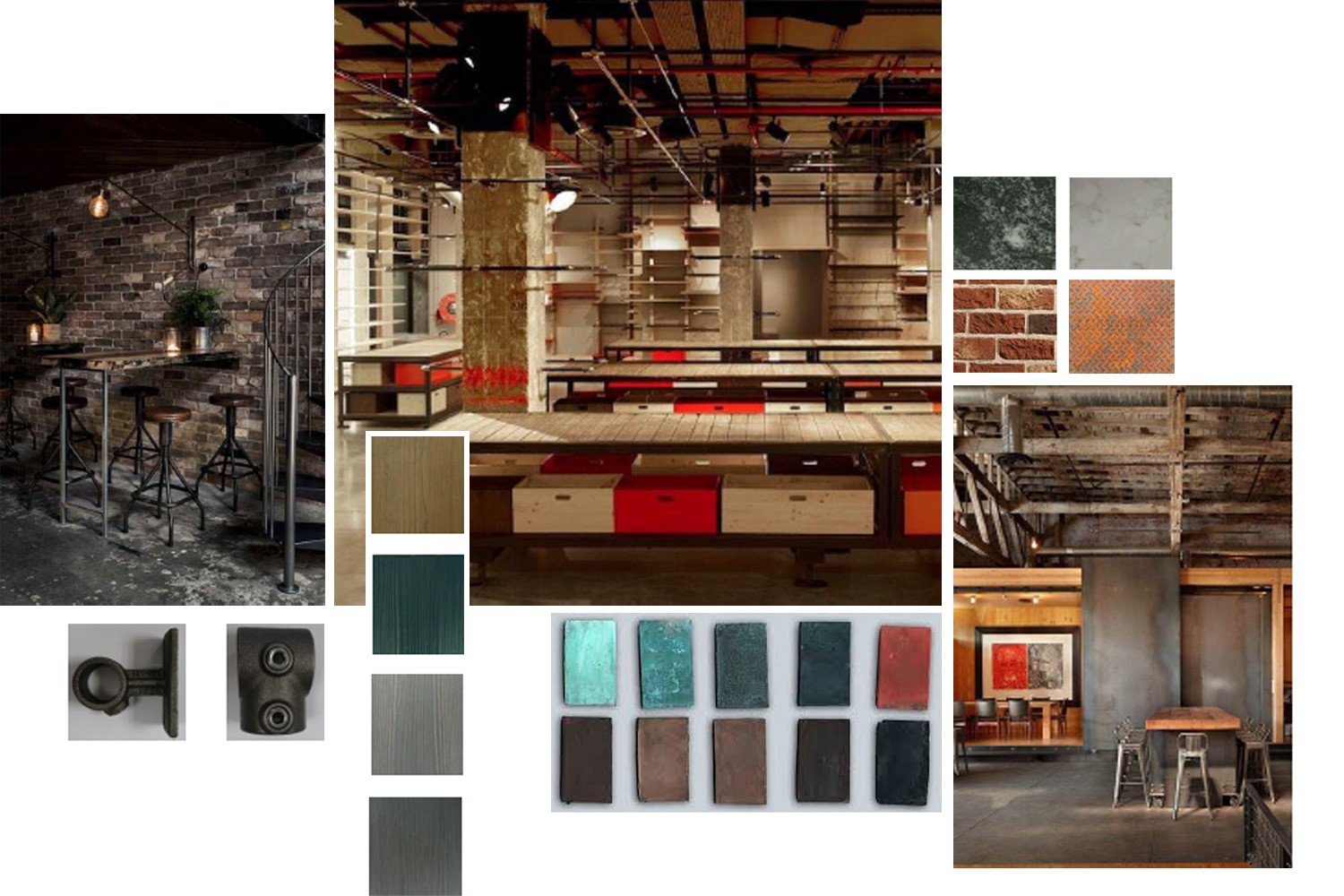
Mood Boards
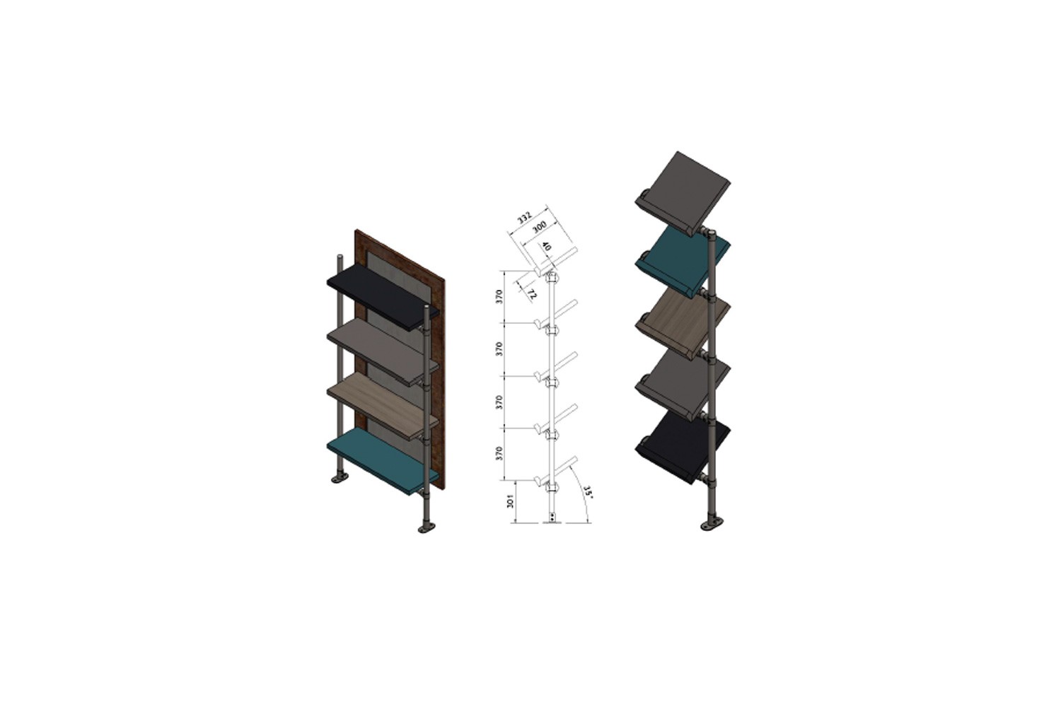
CAD Drawings
The high ceiling and lead windows were immediate features and the double aspect flooded the room with light; it was a great starting point and we decided to compliment it with an Industrial look and feel. Charcoal grey walls, a combination of metals, warm tones of brick, finishes of marble and wooden accents worked well with the industrial features and our mood board began to feel like a great space to work in.
Functionality
For such a busy showroom, functionality was a key factor in the design of the space. The details of how each piece of furniture would house the products was important, and we needed to ensure the displays were not just aesthetically pleasing but practical too.
The London team know best when it comes to taking customers round the showroom and collaboratively we all helped come up with solutions to make showroom appointments more comfortable, informative and efficient for customers. This customer experience needed to be combined with an overall wow factor to showcase our array of design, supply and service capabilities.
Mood Board

Finished Outcome
We encourage customers to put together concepts in the showroom and use the space as they would for a table set up in their own setting. From this, we designed moveable cubes at different heights to create an interactive environment where they could lay up on surfaces that mimicked a restaurant table. The cubes provided further display and storage spaces for products that could be easily moved around on wheels.
Sections
We knew that splitting the room into areas of function and price was logical for customers in appointments, as this had worked well in the old showroom. It also naturally creates visual pockets of interest which splits up a large space and makes it a bit more interesting.
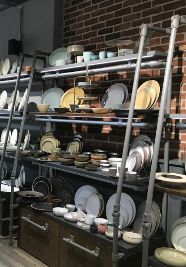
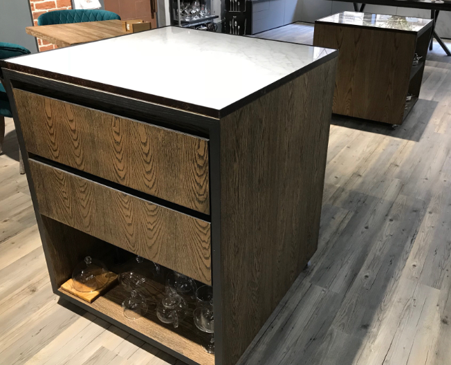
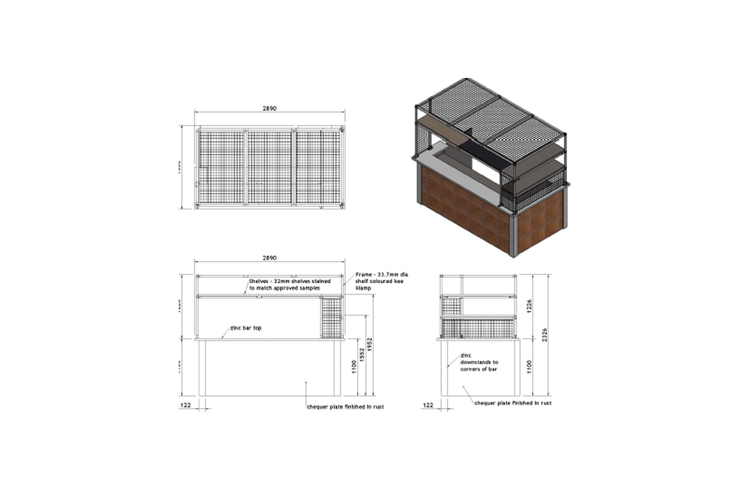
Buffet Area
This section needed to house our largest items so the design of the shelving and display area had to cater for this. We wanted to show buffet set ups as they would be on site, so a deep counter was imperative where we could create different heights with risers and ‘layers’ to the display.
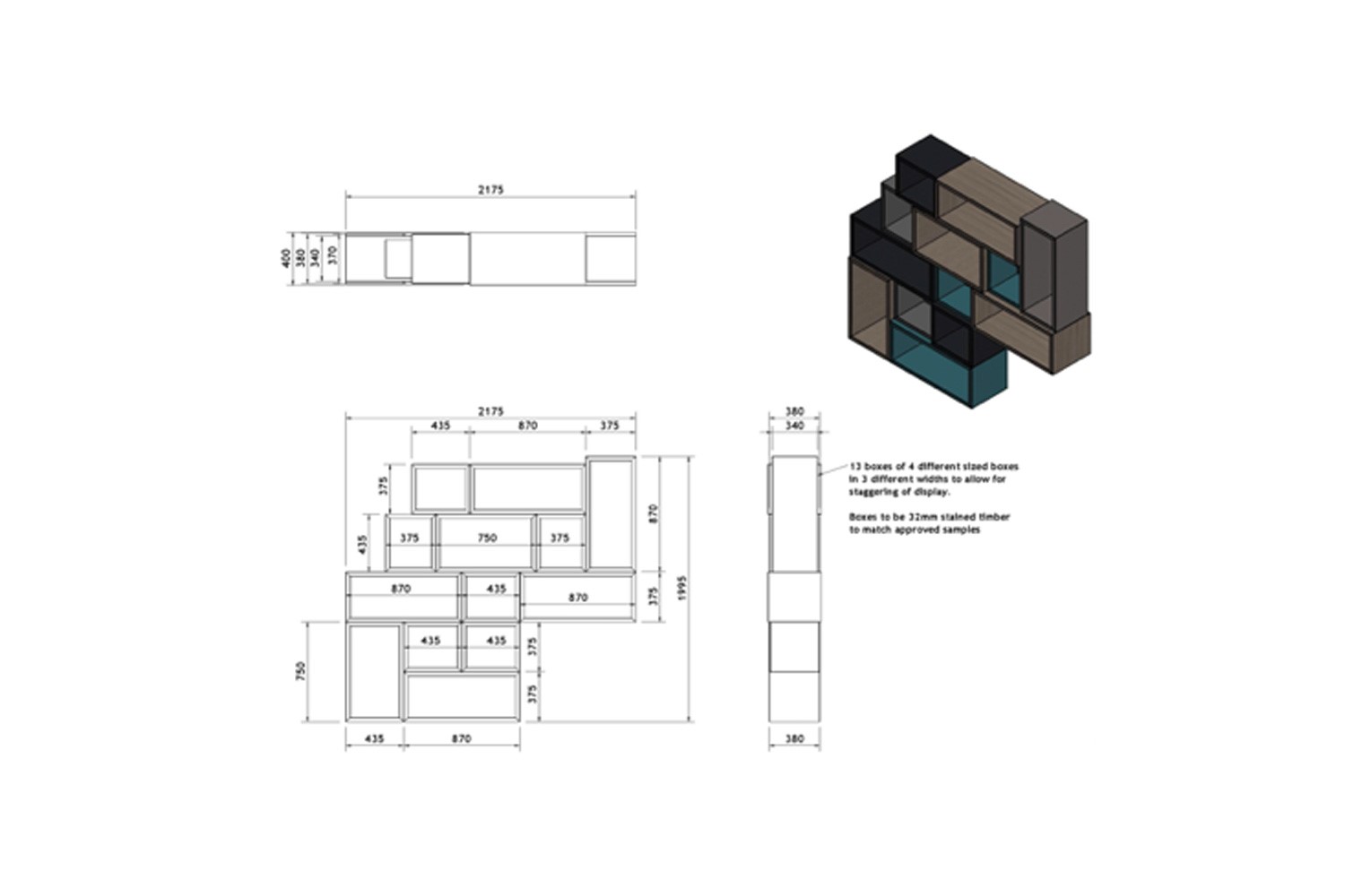
CAD Spec
Finished Outcome
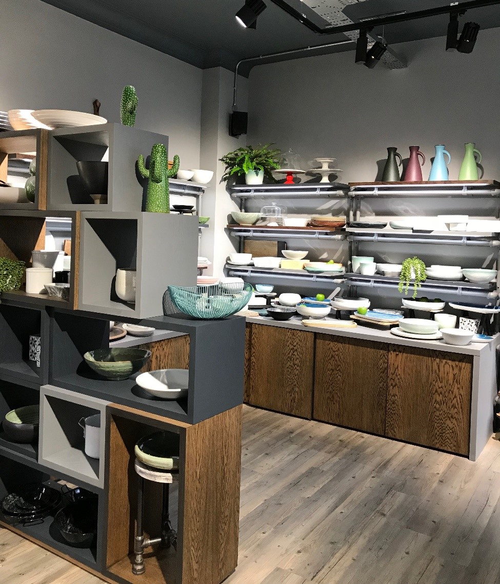
A wall of stacked open boxes creates a divider to separate the buffet section from the rest of the showroom, whilst providing more ways to display products creatively.
This is often a space occupied by large groups of customers, so we decided a meeting table in keeping with the industrial feel would sit well here.
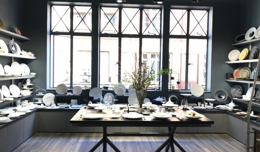
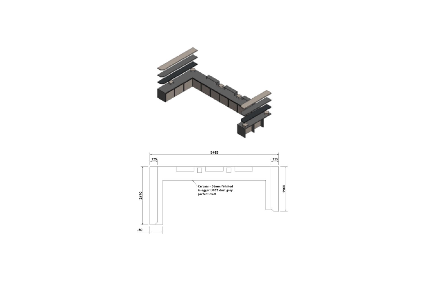
Fine Dining Area
This one was a little tricky as fine dining plates are often white and we needed to strike a balance between a feel of luxury and elegance without it just being rows of white places. This would also be the first area you see when entering the showroom, so it needed to have impact too.
CAD drawings:
Finished Outcome
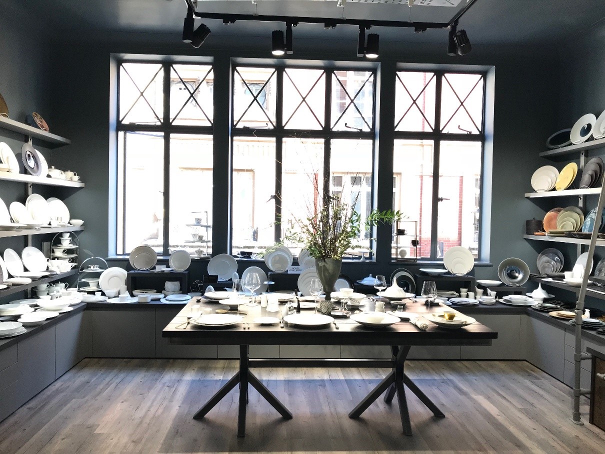
We decided to create a feature within this section and came up with placing a heavy industrial looking table to set up with a mixture of our fine dining plates and accessories that complement each other. To set it off, a tall flower arrangement in the centre would be added.
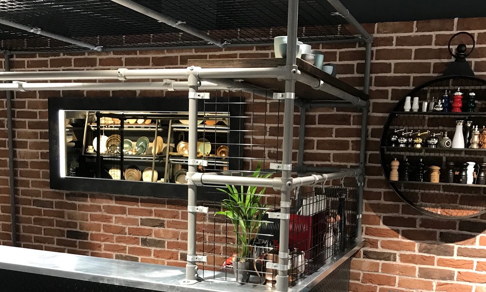
Bar Area
This area would be to serve the purpose of showcasing glassware and create a bit of a hub for customers to be served drinks before a meeting. To make this a real feature of the showroom, we used lots of hard metals against a brick wall background and a bit of green planting to break it up.
CAD Drawings
Final Outcome
Finishing Touches
To soften the look and add a bit more personality we’ve added things like planting, soft seating and themed accessories (this is always the fun part!). Introducing a key colour, we chose teal, injects a pop of colour that we can bring in throughout the room. Teal against the warm rich reds/oranges in the brickwork and the cool zinc metal tones compliments with these well and adds some vibrancy.
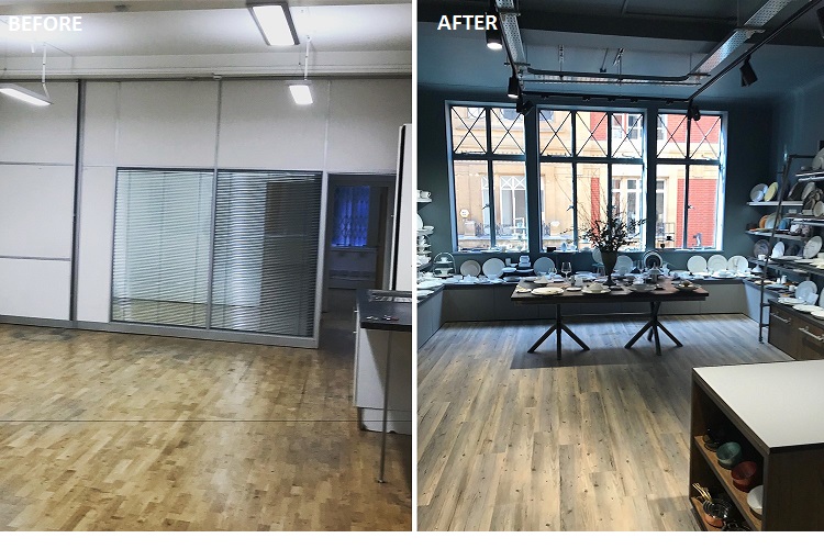
Here are some before and after photos of the space… quite a transformation!

